Posts

1- Canvas Exercise

Image
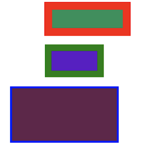
Here we can appreciate my first achievement in Dreamweaver for my Digital Media class. These are actually two canvas exercises. The top one being the rectangle exercise and the bottom being the triangle exercise. These shapes weren't different sizes by accident, we had to create a 400px, a 300px, and a 200px for the rectangle and triangle exercise. The rules were that there shouldn't be any overlap in the shapes created and that each shape had to have a different line width, line color, and fill color. Since it was my first time using Dreamweaver I really had a hard time doing this project and spend a lot of time doing this. Coding every line, shape, and color isn't a simple thing to do for sure.

2- Canvas Landscape

Image
Using Dreamweaver I created a simple but nice landscape . I used all the coding tools learned in class and created a scenic landscape. This workart contains at least once all of this shapes/curves: a line, a rectangle, a triangle, a circle, a quadratic curve, a Bezier curve, and a linear gradient. Using all this shapes and curves I created a house, a flower, a sun, a cloud, and a background which worked as a perfect grass and sunset for this landscape. Even thou this looks quite simple it took a lot of time to create and put the objects were I wanted to. Coding the correct formula to get the desire object and its location in the work space could be sometimes kind of hard and stressful. Time and patience are an essential factor to obtain the wanted results in this complex landscape creation.

3- Spongy Character

Image
By far, the coolest project I had ever done. Using illustrator I selected a Sponge Bob pixel based image and try my best to draw over it to remove that pixel and poor quality of the image. Key tools like the zoom tool, selection tool, eraser tool, and all the color tools I went through every single shape Sponge Bob has to draw this non-pixel image. A key factor to achieve this and create a decent logo/character is to always zoom in objects and create lines and shapes perfectly so it can over those unwanted pixels. Also organizing and having the layers in order is a key component to not get lost and know were everything is at. Even thou its not perfect, I had a lot of fun doing this character since i'm a fun since very young.

4- Calligram

Image
Using a high quality selfie students were assigned to create a body of text workart. Using Illustrator and the tools in it such as selection tool, the direct selection tool, the pen tool, and all colors between other tools, we had to create specifics shapes in the photo to later fill it up with words. The words used for this calligram was based on a letter to ourselves, form the future. Words were shaped with the tools learned in class to fill out the correct spots areas with different colors to create a realistic impact. Even thou I took a good selfie I wasn't able to achieve my goal here. Unfortunately I didn't have the time to finish it. As you can see, I just reach to draw the lines for the words and just fill up most of the hair with the actual words. I almost got to finished the hair, its mostly color and words well mold up. Still I was way far behind even thou I knew I could have done a tremendous job in this one.

5- Self Portrait

Image
As you can deduce form the title, the self portrait its a portrait I did using a high quality image. Once again using Illustrator and the tools in it such as the brush tool, the selection tool, all color tools and blob brush was key in order to achieve what I wanted. This drawing/painting contains many colors and techniques in oder to create a 3D look in the painting. Selecting and putting the right color was essential to differentiate lighter and darker parts of the face we don't realize in our daily basis. The background was added to complete this project and create a finished and unique appearance to viewers. The portrait you are seeing know is just painting, the photo itself was taken away and just used as a guide for the use of the correct colors and lines to create this artwork.

6- Cut & Paste

Image
Here it is, my first photoshop work. The project here consisted in creating an amalgamation image by choosing at least 15 images of living things. Using tools such as the lasso, wand, eraser, and the cut and paste between others. I created a unique amalgamation choosing for example images of my favorite soccer player (Cristiano Ronaldo), my favorite artist (Bad bunny) and also my dog (little frenchie buddy over there.) I tried to use friendly images which people could find attractive and fun to watch at the same time. 

7- Colorization

Image
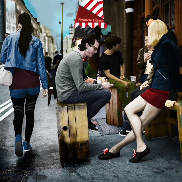
The colorization project was a fun one to do. Using photoshop we had to choose a black&white photo form the options the professor gave us. I choose this one because it seemed to have unique details and a large variety of things which I thought it might outstanding. For this assignment we had to focus in tools like the brush, the paint bucket. filters, image adjustment, and layer info between others to select and give a vivid and realistic color to every single thing in the photo. I try to inspire and use my senses to visualize and then apply color to the photo. There were many different ways to achieve the goal of convincing the viewers, hopefully you can find it decently convincing too.